Brand Inspiration
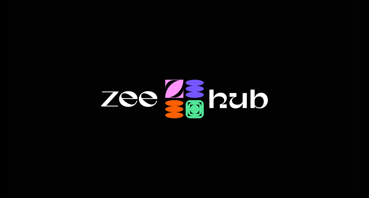
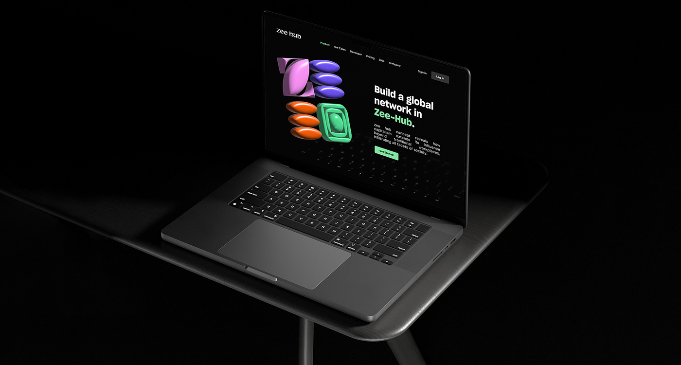
Zee Hub logo is designed with a modern and geometric approach, which is a popular trend in current logo design. The use of geometric shapes and letters often conveys a sense of order, stability, and simplicity. The four colors used in the logo, could represent different aspects of the mall. The Zee Hub logo is designed to appeal to a younger, modern audience who value simplicity, creativity, and diversity. The use of geometric shapes and bright colors could make the logo easily recognizable and memorable, which is an important aspect of effective branding.


